

android app ui ux design
Designing for Android 🤖
From 2018–19, Android made up a massive market of 74.45%, whereas iOS captured 22.85%.
So it's clear that leaving design for Android users may result in less business capture and reachability.
I'll be covering tips to design for only latest Android devices.
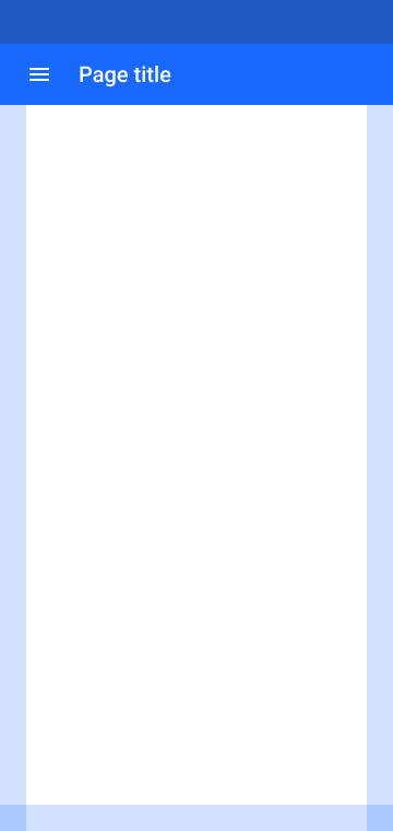
Material Guidelines
Material Design is a visual language that synthesises the classic principles of good design with the innovation of technology and science.
You see, read a nd hear this all the time to use material guidelines for your Android UI designs.
Material Design is a vast and deeply explained set of principles and good practices that can sort out the way we design our mobile UIs.
But, does that help? The answer is, NO! Why?
Due to detailed structure, designers fall into the loop — is this component flexible enough to redesign or just pick that up from the kit. This abstain UI designers to innovate and present their at par creativity.
And believe it or not, most of the designs are just built up from a kit and hence most apps on Google Play store look exactly the same.
"Material Guideline is the Bhagavad Gita/ Bible for Android UI designers"
When I say "Bhagavad Gita/Bible", I mean you don't have to do everything it says but you can follow the principles and process as foundation of your own kits and guidelines over that.
Material design guidelines are contradictory 😱
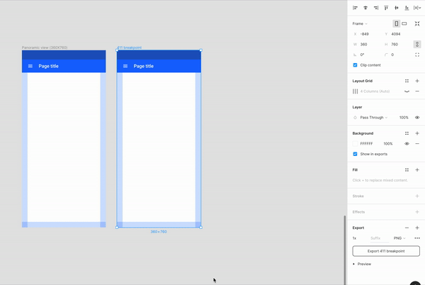
In the guidelines, it's mentioned to use a 4 and 8 point spatial grid layout and 360dp breakpoint for Android phones.
But on every new Android device (including Google Pixels series), the breakpoint for maximum width is 411, which cannot be calculated as per Material design guidelines and spatial grids. I was trying to calculate other breakpoints as listed on Material.io for large handsets, but could not find an optimal solution other than 360dp. Though 720dp is an optimal breakpoint as it's a factor of 4,8,9,12, but that's too large for mobile designs.
What do I do?
- First select Artboard of any recent Pixel device (for general Android app), or an Artboard of specific Android Phone (e.g. Samsung Galaxy S10) if you want to target app to specific device.
To select perfect artboard size, refer to An ultimate guide to selecting the perfect artboard size for mobile and keep 360dp width as breakpoint.
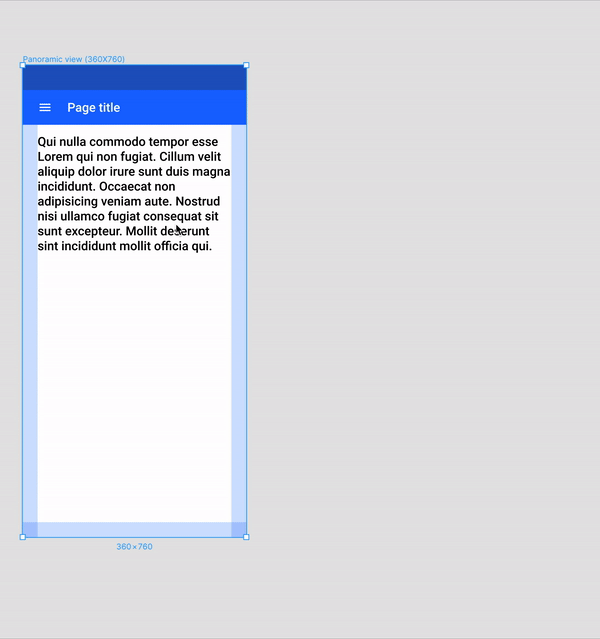
- Make a layout grid (using 4–8 point spatial grid) and place smart guides for fixed components (App Bars: Top, Bottom Navigation, Notification/Status Bar, etc.)
Learn more about Material Responsive Grids — Here
- Due to Waterfall and Infinity Displays, I always keep extra margins on sides to keep other functionalities and make it useful instead of unwanted touches on the main activity.
Till here, the whole layout is ready to work on.
How selecting 1 or 2 artboard sizes work for every single phone? 🤔
Well it's simple,
"Think like developer, create like Designer"
Android Developers use Constraint Layout, it is an Android View Group which allows them to position and size components in a flexible way.
As designers we can use the same concept/ process initially in our designs to reduce dependency and easy developer handoff.
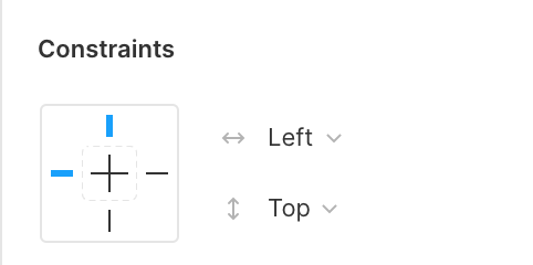
Most of the modern product design tools include Constraints/ Responsive resize for Designers.
It helps you to define components in a flexible way.
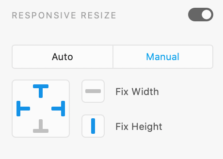
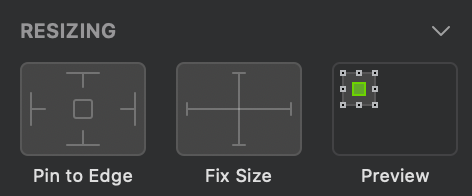
Using scale constraint
Use scale/ fix size for height and width if you want your components to scale as per device dimension (a.k.a. Match Parent in Development).
Using fixed size or vertical grow for text box
It applies a behaviour to wrap content as it grows or reduce on the horizontal axis.
Developer Handoff 🤝
Device Metrics
Google Material provides a list of comprehensive resource for sizing, resolution, and more across multiple devices — Device Metrics
You can take help from the list or simply look out for resolution of target device and try to calculate the render rate/ density of your device.
For an e.g. Samsung Galaxy S10 has a resolution of 1440 X 3040 and it's minimum width is 411dp, hence the density is 3.503649635X xxxhdpi

Taking minimum width as 360dp, density will be exactly 4X xxxhdpi.
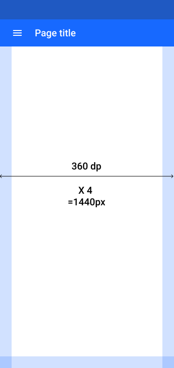
Rather than calculating into decimals I prefer to use 360dp breakpoint.
Both designs will render at same device with a resolution of 1440 X 3040.
Exports
Android does not have a fully vector-based solution, so developers can not use SVGs directly into their code. If you're required to support devices running an Android version earlier than Lollipop, you're probably better off simply exporting the images. Read out this article by @marit.idris for more information on exporting images for Android.
Devices running latest version of Android (later than Lollipop), supports vectors that can be integrated directly into Android Studio and as a designer you just have to export SVGs for same.
Other than icons and images, text and components should be handover via tools like Zeplin or Avocode. Figma and Adobe XD also supports native handoff features. Remember to specify constraints values if you are using tools like Zeplin.
Export mockups and share prototypes with developers to make your design alive. You can find mockups on my Behance link.
Conclusion
Let me quickly summarise all that I've said.
- In 2018–2019, Android made up a massive market of 74.45%, don't leave it behind.
- Material Design is a vast and deeply explained set of principles and good practices that does not help each and every-time because it's contradictory.
- Use 360dp breakpoint for better design calculations.
- Use constraints and layout grids to design once for all.
- Handoff for targeted devices based on their density and always remember to specify constraints values.
If you liked my article, connect with me over LinkedIn and say "Hi 👋".
Buy me a Ko-Fi ☕ and support my content by pressing 👏.
You can write to me directly via WhatsApp or find me on Instagram or Dribbble as @appy013
Check my 1st article published by uxdesign.cc — An ultimate guide to selecting the perfect artboard size for mobile
android app ui ux design
Source: https://uxdesign.cc/how-i-design-for-android-1bf2904f1a05
Posted by: calderonades1986.blogspot.com
0 Response to "android app ui ux design"
Post a Comment